We’re starting our own business! We want it to be disruptive in the industry, cut through the jargon and be straight talking. We’re gonna call it Yellow Sub. what do you think?
Most clients come to you simply with an idea! Alex and Gareth came to Orchard with a dream, to be different, to challenge the industry of three letter acronyms and bring geo technics, hydrology and land regeneration kicking and screaming into a new age.
The work life balance often blurs these days and spending time with Alex out in the open on our mountain bikes, taking a breather and ‘Victor Meldrewing’ our thoughts on industry, life and everything really helped me get under the skin of the Yellow Sub dream and stories about dirt.
It started with a conversation on our road trip camping and biking in scenic Elan Valley. That spark of an idea, the dream of a business with a clear ethos never stopped flowing and throwing ideas at each other sparked excitement all around… all the while in my head, I was drawing shapes, building concepts of a clean brand architecture that would mirror the thoughts Alex had been telling me about of what this thing could be.
Heading up the design department at Orchard for my day job gives me access to a diverse team of creatives who bring great ideas to life on a weekly basis. This got me thinking, ‘We could help these guys’! follow that dream, build something special and give them a platform to challenge the norm.

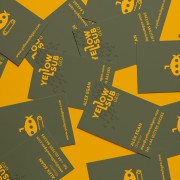
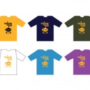
Not all creative projects start off the same and this one was no different. ‘I love the idea of a yellow submarine on a T-Shirt’ Alex says… "Cool, but what makes it different to any other Yellow Sub out there? We needed something typographic as well as symbolic to help tie it all together." Our goal was to provide Alex and Gareth with a platform to be proud of. One that represented their business wholeheartedly. We started planting the seed of icons of submarines with appendages, sort of like a swiss army knife of icons. This alone felt lost without some sort of typographic logo to spell out the business name. Acronyms were a no no, so Yellow Sub went through many fonts and itterations before settling on Hurme Geometric Sans 3's robustness which gave the logo mark confidence and presence on the page. The addition of the periscope happened by accident while accidentally stretching the L in the wrong direction during the exploration stage. Yellow Sub in words, forms the shape of a submarine with periscope. The excitement was brewing and the buy in from Alex and Gareth at this stage was electrifying. When the penny drops and you find that nugget that simply works, every other idea you try just fails in comparison. We pushed this logo around a number of scenarios to check it was workable in digital and in print, on T-Shirts, presentation documents, stickers, mugs, business cards, you name it, we tried it! Submarines ? :)
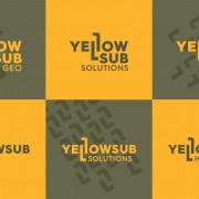
The letterform for the primary logo mark was only part of the brand here. A quick sketch showed that simply a yellow submarine wouldn’t cut the mustard.. We needed something different; Enter digger tracks. A few WhatsApp screen grabs back and forth, got the guys super excited about the prospect of a mini submarine with big tracks animating around and all over their collateral.
We got ourselves a logo!


It’s crazy how quickly a finalised idea can be fleshed out once the bones of that concept sync in: Use the Periscope shape to create all forms of tyre tracks and structures within the iconography. Ian Anderson of The Designers Republic was a great influence in this thinking with his work on Pop Will Eat Itself album covers and Wipeout artwork! It really helped inform a design style we all fell in love with. It was established quite early on that there was to be 3 strands to the business services; Geo, Hydro and Solutions. This helped us shape a brand hierarchy for future use. Yellow Sub as the primary mark and suffixed services neatly tying it all together.
A brand is more than just a logo!

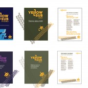
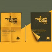
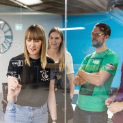
We work hard to bring our clients vision to life and the journey so far with Yellow Sub has been fun, creatively challenging, but enjoyable all round. In the mix of touchpoints created so far for Yellow Sub are: brand guidelines, logo packs and templates for the guys to use to sell their wares, animations to help digest complex scenarios and a website to act as the shop window into the soul of the business. All of these things have come together through openness, creative freedom and collaboration. The Yellow Sub team have spent a few weeks at the Orchard offices, settling in, making tea and bouncing ideas around with the studio to ensure every crumb of content fits the story. We’ve found our working environment to help forge great working relationships with clients and have to say, it helps having Alex and Gareth on hand working directly with the people that count, being reactive to changes and testing ideas on paper and on screen.
How do we get a website done?
Content is king, it really is! It helps inform design, layout and approach to information delivery. The website content was fleshed out well in advance by Alex, Gareth and their associates, which gave us a massive level up when it came to the design in order for the Yellow Sub massive to get their hands dirty and test the water with different content layouts, gather images, case studies and testimonials to help tell the story of Yellow Sub - Geo, Hydro & Solutions in an honest visual way. This also gave us a chance to show the team ‘Symphony CMS’ as a content management framework. It’s become our go-to system for building flexible website structures of late. It’s almost the open source equivalent of Craft CMS with a few more years under its belt and Orchard team members are part of the working group that contribute to the Symphony CMS project.
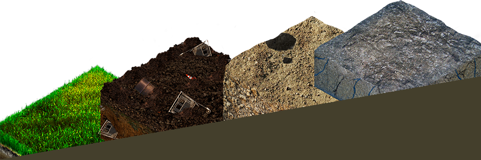
In the mix of content review, it was established that we'd need a great hook to explain to potential clients what exactly land regeneration entails. We need a short animated sequence to do this!! what can we do Andrew? Lucky we have in house animation capabilities guys:) Our resident guru Mathew Bevan brought the concept to life in a few weeks. This visual now forms the basis for the home page infographic and presentation openers. Great work Mat!
This is the beginning for Alex and Gareth, it’s also the beginning for us on that journey with them. We’re super excited to push this work out there and have lots of work planned to help elevate the creative to the next level. Keep an eye out for #yellowsubversion, #yellowsublime and #livelifeyellow in the future. Onwards and upwards gents! Your journey has just begun.